Graphic design is a talent that may help you both personally and professionally. Perhaps you will require graphics for your blog, social media postings for your small business, or a tailored presentation for work or school.
Graphic design, however, might be daunting if you’re just starting out. There are several tools to master, as well as numerous design concepts to employ. From font selection to alignment, color theory to balance and symmetry, and general designer guidance, here are ten graphic design ideas that every beginner may put into practice right now.
1. Maintain Simplicity

Keeping things simple is the number one and most crucial design guideline for non-designers and beginning designers. Nothing is worse than an overpowering, difficult-to-understand design.
In order to keep things simple, channel your inner minimalist. Keep the amount of text and typefaces to a minimum, the colors under control, and the graphics balanced.
2. Make Use Of a Color Palette That Is Consistent

Color palettes and color schemes are just as essential as the message you want your design to convey. Choosing the ideal color combination, on the other hand, is not always easy.
Fortunately, ready-to-use color palettes are widely available.
The extraction of colors from images is a fantastic technique to generate color palettes. You may accomplish this within your editor by selecting the color picker and then clicking the plus symbol. Once you’ve uploaded your image, you’ll have a new color palette to work with.
We recommend Adobe Color, a website that extracts multiple color palettes from every image, for more comprehensive color palette extraction.
3. Keep the Typography Under Control

For non-designers, the art of font selection has a bad rep in the world of design. The variety of typefaces accessible online might be overwhelming.
Not only that, but you must understand how to match typefaces in a design to make it seem coherent and attractive.
Using tried and established pairings is a fantastic approach to avoid the stress of trying out a million different combinations. Professional designers enjoy fresh and beautiful fonts as well, but if you ask them, they will tell you that they only employ a few classic fonts the majority of the time.
If you want to build your pairings with different fonts, one simple rule of thumb is to use one novelty font for headings and one conventional classic font for all the content. Here’s a wonderful resource for saving time when matching fonts: a list of tried-and-true pairings for various circumstances.
You may even utilize a single font family and match its different weights together. For example, a Montserrat bold for the header, a Montserrat regular for text blocks, and italics for subheadings.
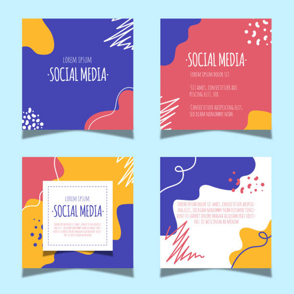
4. Social Media Templates Help You Save Time

Social media is one of the channels where visuals must be generated on a regular and consistent basis. There is no better way to save time than to use pre-designed templates.
Social media managers must work on a variety of channels with varying sizes. Fortunately, there are templates for every channel and size.
5. Make Advantage of White Space Wherever Possible

White space isn’t really “white.” White space denotes an empty space with no writing or objects on it. It is the part of the design that “breathes.” This is a more difficult design method to master than others.
Minimalist design is a great way to learn how to use white space. This is a trend centered on the concept that “less is more” and that a graphic just needs the essential requirements.
Negative space is another way to employ white space. This is a method in which empty spaces communicate a narrative more effectively than those in the background or between other pieces.
6. Improve Readability

Another excellent piece of advice is to always make your content easy to read. This includes how you overlay text on backdrops, the colors and fonts you choose for headers, and how elements connect to the text and the design flow.
Select the ideal typeface for your project, one that not only corresponds to your message but is also easy to read. It should be simple to read over a backdrop picture or texture.
Make every effort to make the context in your design clear to read and understand. This is true for both the text itself and visualizations such as charts and data widgets.
7. Make Effective Use Of Spacing

When it comes to constructing balanced compositions, one of the most crucial tools is good spacing. Spaces can be seen in the margins, between forms, paragraphs, lines, phrases, and even between letters.
As previously stated, space is basically white space. The difference is that in this situation, it serves, as a rule, to assist you in aligning elements, keeping them balanced, and complementing one another.
8. Consider Kerning

Kerning is defined as “the adjustment of space between two specific characters” by Fonts.com. The spacing between letters in text has an effect on how it looks and should always be taken into account when incorporating typography into any design. Improved letter-spacing results in a more appealing, readable text.
One piece of advice is to not let your font kern for you. Some typefaces (particularly free ones) have irregular spaces between letters, which makes them appear amateurish. Adjust the kerning in your graphic design program to get a clean typographic finish.
9. Balance Is Essential

Balance gives a design a steady appearance and allows the viewer’s eye to travel easily between parts. It is about arranging things equally across the design so that it looks appealing and not cluttered. It is crucial to remember that balance does not necessarily imply that everything must be the same size or precisely aligned.
Begin by equally loading your design on the left and right, as well as above and downwards, to achieve balance. If you think your design might benefit from some unevenness, you may attempt breaking the symmetry afterward by shifting your pieces about.
10. Put On Your “Designer Goggles”
Designer goggles are worn by good designers as they view the world. Look around you with a designer’s eye at posters, logos, advertisements, websites, and architecture. You could just get a burst of inspiration when you least expect it.
Make time every day to produce something. If you aren’t feeling inspired to create anything new, consider replicating a design you like. Daily practice will help you improve your abilities as a novice designer, keep your creative juices flowing, and establish your own distinctive style.
It requires theory, talent, and practice to create good designs. May these graphic design tips get you started on your way to producing beautiful and efficient designs.