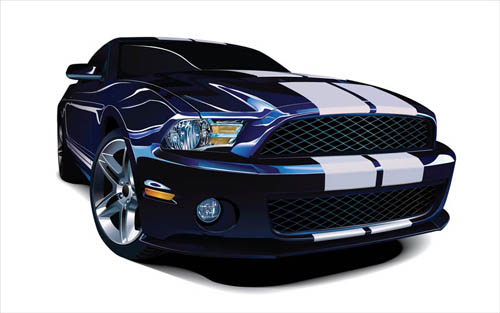

Learn to create this photorealistic vector Mustang car in this new Illustrator tutorial written by Bobby. Bobby has done several vector car illustrations on Deviantart. He has also received 5 Daily Deviation features and is known for his vector car illustrations. For the very first time, he will share with you his secret techniques in car illustrations. You will be able to get an insight on car illustration after this tutorial.
See some of his fantastic vector cars collection in his portfolio.
Requirements: Adobe Illustrator
What will you get?
- Instant download of PDF e-book (35 pages)
- Learn the techniques and tricks to draw a photorealistic car
- Comes with final car in high resolution jpg for easy reference
Tutorial Preview:
To draw the grill
Grill is again geometrical. There are a number of things that we need to achieve in this.
- Background gradient.
- White shadow for realistic effect in the grid.
- Black grid for the holes.
- Mask the grill.
For the 2 and 3 I drew a separate hole with pen tool. Then I copy pasted it geometrically along with each other and created the pattern. Don't use pattern fill method here as it doesn't give you the option to fill and manipulate the various paths individually. Then I used the envelope distort to put it in the shape as it is in the real image. I use envelope distort in such a way that my rectangles sit exactly on top of the rectangles in the original image. It's always better to count the grid holes and use exactly the same number as those. There are 12 holes in horizontal and 5 in the vertical for the lower grill.
Once you have all the holes in position, group them. Create a copy of them and put them above the earlier group. Now you have two copies of the holes. The lower group we will use to create the highlight ie white bevel effect. Color the lower layer fills as shown in the Fig 010.
Now move the upper layer a little to the top and left so that a fraction of the lower layer is visible at the bottom. This will give the illusion of highlight in the grill.
Now simply mask all these paths so that they fit in the bumper.

Fig 010 – The grill components

Fig 010-2 : The finished grill layers
To draw the areas surrounding the lower grill
There are very minute details that go into this area. If you concentrate a little, you will be able to divide all of these reflections into separate gradient colors. I drew 18 different paths filled with different gradients filled in them to achieve the finished effect. You have to be very cunning to set these paths in a proper arranged manner.
Consult Fig 011

Fig 011 – A total of 18 paths create the lower duct and Grill boundaries.
Reflection on the bumper
This is a very complex section. Reflections are always hard to draw. First fill the background gradient. Next create the blue tint area followed by various small reflections. Use blend as shown in images and set these paths on each other so that the final result is achieved.

Fig 012 – reflections on the bumper.

Fig 013 – Detailed explosion of the reflections. 5 layers.

Fig 014 – The complete explosion of the bumper reflections including the white stripes.
... end of preview. Sign up for premium membership to read the whole tutorial!


Hi Mark, thanks for your interest. You will need to sign up as a premium member to download it. You can sign up from https://vectordiary.com/membership/
Man… that takes some skill, time and good patience to get to that level of drawing in vector. Someday though I’ll give it shot on my car. In the meantime, excellent work!
Very nice!! The detail in the headlight is outstanding!!!
Thanks everyone for liking the tutorial. =) This was my first for vectordiary
Your first! Wow! Still, i am sure years of experience are behind the work… Good stuff.
Here you can find Photo-realistic Vector Drawings – http://vector.artsstock.com/page/search/tags/photo-realistic
excellent! realistic work is absolute real.
i love car
i love this car
Free Vector – Convertible. Cabriolet Car – http://vectorlib.com/Technology/Vectorlib-Freebies-Convertible-Car-Vector-Illustration.jpg.php
Amazing Tutorial..i must try it.
very good tutorial this type of art really help designers in their software command
I like this Tutorial… Can I get it please?
Love learning new techniques. I have been experimenting as well: http://www.nineteenfortyone.com/2012/08/5727/