
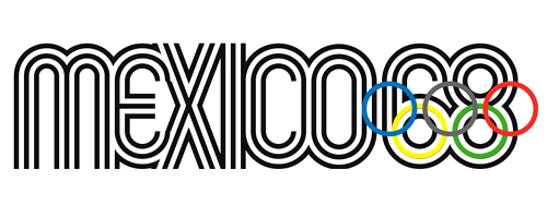
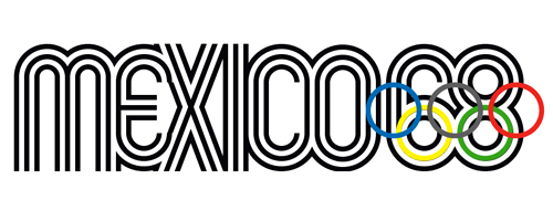
In this tutorial, we will continue the series of the best Olympic logos walkthrough. Today, we will recreate the amazing logotype of Olympic Games in Mexico of 1968. Although the logo was created more than 40 years ago, it still remains a favourite piece of design and typography for many people. We will use Adobe Illustrator features to recreate this unique logo. Let’s get started!
Getting Started
1. Open Adobe Illustrator (I use CS3 version) and create new document 1000×500 px. Make it RGB color mode and turn on grid (Ctrl+’) and snap to grid (Ctrl+Shift+’). Adjust your grid by going to Edit>Preferences>Guides and Grid, make the grid 40 px with 10 subdivisions. Finally, create a rectangle 800×200 px in the middle of artboard, position it to touch the larger grid borders and convert it to guides (Ctrl+5). Lock it – this will make the borders of our type. I would also recommend you to turn smart guides on (Ctrl+U).

Creating the Custom Typeface
2. We will start making the custom font now. In order to exactly recreate the logo, we must enter correct values for every shape. Besides, for some shapes we should consider the stroke width of future letters – it will be 40 px. Anyway, all the calculations are already made, so let’s start with the font.
Grab the Rounded rectangle tool and hit Enter, for width enter 64 px, for height enter 212 px, and make radius 32 px. With Direct Selection (A) select the bottom point and delete it. Now align the shape with rectangle guides as showed below. Now Alt+Shift+drag the shape to copy it placing exactly beside the first one.

3. For the next letter “E” we will use rounded rectangle again. But this time we enter different values, as the shape is different: for width enter 80 px, for height – 160 px, and radius set at 40px. Select the shape you just created and make a copy of it (we’ll use it for some other letters) – simply Alt-drag it away. Now, select the original rounded rectangle and position it 16 px to the right of “M” – it is equal 4 small grid subdivisions. Now select it’s right segment with White Arrow (A) and delete it. Finally, create a horizontal line in the middle of it to complete “E” letter.

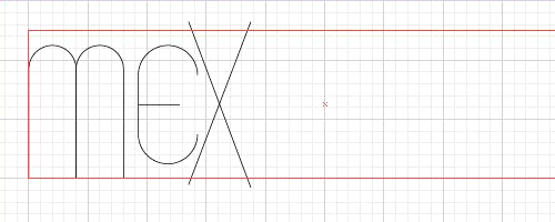
4. Let’s move on to the next letter “X”. Take a Line tool (\) and create a diagonal line that overlaps the borders of our guide rectangle. Now take a Reflect tool (O), click Enter and choose Vertical option, press copy. Now you have two crossing lines that will make a letter “X”. Try to position it like in the image below.
Applying Multiple Strokes
5. I think now it’s time to check if we are making everything correctly. Make sure your shapes have no fill and black stroke. Select any shape you have for now (I choose the small horizontal line in a letter “E”) and make is’s stroke width 40 pt. Now go to Appearance panel (Shift+F6) and select “Add new stroke” in the flyout menu. Make the new stroke white and 24 pt wide. Duplicate the new stroke, make it black and 8 pt wide (img. 5-A). This way we recreate the future font. Now, with the shape selected, go to Graphic Styles panel (Shift+F5) and press New button to create new graphic style. All you have to do now is select all letters and apply new style to them(img. 5-B).

6. We have applied multiple strokes and now it’s a good time to adjust the positioning of the letters. Make sure the letters are within the rectangle guide we created in the first step, and that M and E overlap correctly – outer black stripe of one element must overlap middle black stripe of another one. Also, select the X letter and send it to back (Shift+Ctrl+[) to see the border between E and X. Move it so that the middle black stripe of E flows into the outer black stripe of X. They don’t have to intersect exactly, but we’ll correct it later.

7. Let’s continue making the font – create a vertical line with Line tool (\) to make an I letter. Apply the graphic style we just made to it, and again, position it correctly, so that outer stripes of X and I overlap.

8. Now, take the rounded rectangle we copied when creating E (80px wide, 160 px high, 40px radius) and put it after I letter. Duplicate it and move it to the right. For the first one, select it’s right segment with Direct selection (A) and delete it to make C letter. Again, apply the graphic style we made and adjust the positioning like on the picture below – make sure they overlap correctly.

9. We have completed the letters, so let’s move on to create the numbers “68”. Take the “C” letter and Alt-drag to duplicate it, now grab the Ellipse tool (L) and create a circle 80×80 pixels. Position it so that it forms “6” number with copy of C letter. To make “8” just take two copies of the same circle and align then vertically. Again, apply the graphic style and position all objects to correctly overlap each other.

10. Okay, so the custom font is ready, but if you look carefully you’ll notice that the way stripes overlap is far from original, as every stripe has to flow from one letter to another. It is impossible to produce with multiple strokes. We’ll need a different approach. Select all the shapes and go to Appearance panel. Delete the two top strokes, so we are left with single black 40 pt stroke. Group all letters and numbers.

11. Now select the group and make a copy (Ctrl+C and Ctrl+F), and change the stroke width of this group to white color 24 pt width. Repeat these steps to make the third group. This time make the stroke black 8 pt width. This way the emblem looks much better with correct stripes’ position. The main shape is ready now!

12. You may notice that X is too tall. We will correct it now. Create a rectangle that will crop our letters above all the groups, it must have 200 px height with no fill. Look at the rectangle guide we made in the first step (you hide the guide and grid now). Lock the groups for now so that you won’t accidentally select it. Now, go to the flyout menu of Layers panel and choose Create clipping mask option – the rectangle will turn to mask.

Creating Olympic Rings
13. All we need now is the set of Olympic rings. To make them, create a circle 80×80 px with no fill and 8px yellow stroke. Position it over the middle stripe of “6” number, copy it and place it over “8” number and change the stroke to green. Place 3 more rings over these two so that they overlap, make their stroke blue, gray, and red. Now group all the rings. Voila – the logo is complete!
Conclusion
We have completed one of the most outstanding Olympic emblems, Mexico-1968, which involved creating custom type and clever usage of strokes. I think the designers of this logo did wonderful job. This method can be applied to any text and the results will be look nice – as such technique is really timeless.
To download the source file for this tutorial, you will need to login as a member.
Sign up today to access all exclusive members content!

I love that you did it manual,not using a font. only thing I didn’t liked was the screens in rusian. great job
Images don’t exist!!!
Download link is dead! Fix it,please!